Hear me rant about the process of designing my capstone project, while people that have no clues about actual designs scream at me for not doing it well enough.
2026, huh. This is my final year in the course for a Bachelor’s degree in Software
Engineering. It’s quite blurry here, the line between Software Engineering and Computer
Science, but you should get the point.
Our capstone project, a team of 5 developers and 1 designer (me) has been on the
rockiest of starts ever since it started in November of last year, and I’m really
not proud of it at all. As a designer, getting creatively blocked is extremely
taxing and feels really bad after a week of drawing rectangles on Figma. Let’s go
into the issues of this project, shall we?
Using Turborepo and oRPC, basically frameworks that are way too new, too untested
for such an important project.
Does not have any process to iron out engineering specifications, software requirements
specifications or even any product specifications. It seems like everyone agreed on what
to build, and I don’t even know what we’re building.
Literally nothing seems to be documented.
Over-prioritizes using free tools, over some stable technologies for a capstone?
Every new week there’s a bug in oRPC, there’s a refactor and a rebase in backend.
Using path-based routing for a multi-tenant app, real good. A real brand would LOVE to
see your your-project.freerender.com/09812-babc-ooo0-92bm-cauj-d2/1293-baoov-jal-dj93u-vdk
as their restaurant’s URL when their customers click.
Deleting the entire database and re-inserting it with data as a way to “update” and “sync”.
Well, you get the point…
Problem 1: Business Entities
Most developers would go extremely hard on data normalization (a method to de-duplicate
data in databases), and would do mental gymnastics with joins and relations just to
get some simple data points. For example, if I have an eBay platform, I would cache
the product’s view counts in the row itself, and periodically update it, not count
every foreign keys in a views table every single time.
For example, imagine a menu with drinks, and each drink can have addons for you
to choose like Sugar Level, with choices as 0%, 50%, 100%. Simple, right? Not so
fast bucko. By their standards, the 0% sugar here is the exact same record as
another choice inside a group for Salt Level, because they share the same value: 0%.
But the problem is that, those two 0% are legitimately different business
entities. They mean entirely different things.
Problem 2: Glaring Design Flaws
Of course, before actually designing anything, I would have to bounce my ideas off
others first, by asking or showing them simple prototypes to see what they would
like it for. But most of the times it ended up being bouncing ideas off, instead
of showing too much as the prototypes were not finished.
To summarize, we want a multi-tenant restaurant management platform, that has the Point
of Sale system of GloriaFood POS, while still providing customization as tenants
register with us, and don’t simply purchase a license copy, so users can choose from
a centralized storefront, like DoorDash. That’s supposedly what the professor wants
to make. And just, by simply asking and bouncing off ideas for designs, I already got
so many questions about the system. I already asked the professors these, and I’ll list
out his answers so you know why this is such a difficult team to work with.
Problem 3: Clash of Design Principles
There are a bunch of clashing styles in the design principles of me and the
professor, which further proves me right that he is in no place to judge anything
from a user-friendliness perspective. A hand-holding CRUD app is not user-friendly
when you face it 40 hours a week.
Navigation Bar
There are two directions proposed here, and clash with each other heavily:
Horizontal Bar (Mine): A simple 6-item navigation bar for the most frequently
used options in a restaurant, with more infrequent options put away in the “More”
item.
Vertical Aside Menu (His): A full vertical list of items with collapsible
or expandable tabs.
Their principle is a simple vertical list of navigation items. Such as when you
as a waiter would have to click “Menu” hamburger button, then click on “Orders”,
then click on “Your Orders” to see who you have to serve still. This layout is
conventional, works for almost every dashboard. But is it truly what this app
needs? We design for the SRS, the use case, not design for what is conventional.
Now imagine that waiter having to check on Tables again, they again, go to “Menu”,
click “Tables” and then “Table Reservations”. Now they want to check whether the
chef finished their order, go back “Menu”, click “Orders”, then click “Your Orders”.
What is this madness? That flow is 2 seconds, looks fast to the professor, easy
to understand, but is it really what fast food worker needs?
My principle is to hide away the vertical listing of stuff into a further screen.
In a fast-moving restaurant, people at the Point of Sale system want something that
works, fast, and they can carry out their tasks without the software hindering them.
As a waiter, I don’t want to go into the menu every single time I move around tables,
and even in a POS system like this, desktop-first design would break, because how
do you expect waiters to move around with a tablet or even a laptop? As a manager
watching over tables, do you want to go into the menu and perform that flow “Menu” ->
“Tables” -> “Table Reservations” every time you want to switch context to see progress
or dashboard, or do you want it to be a one-click bar to quickly navigate to the
tables view?
A lot of people underestimate how large a 1-second delay is for high-velocity teams
like actual restaurants. A manager sitting at the desk watching over orders, tables
and menus would need to switch context a lot, and every 1-second delay adds up. Every
single time they make a mistake and click a wrong item, and have to wait for that page
to load, then another 1-second delay to just click the correct navigation item. It
easily frustrates a busy manager. For a developer testing in his local environment,
that 1-second is nothing.
Even if there are actually a lot of pages, all of that can be put into a further
“Settings” or “Others”, as they are less frequently accessed. Therefore, I picked
the following tools to be on the navigation bar, better named “Quick Bar”: “Dashboard”,
“Orders”, “Tables”, “Menus”, “Users”, and finally “Settings” / “Others”.
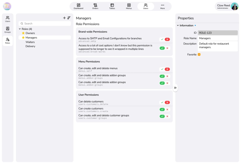
Three-pane layout for management tools
These UIs are made for restaurant managers as the main actors, as most employees
wouldn’t have access to these dashboard or role-management interfaces. So, I figured,
if it’s a multi-tenant platform, which means we would have to serve restaurants
that have a decent number of human resources. And putting myself in their shoes,
what would I want the app to do for me?
Here’s my solution, a three-pane layout progressive disclosure tool:
This reuses the same three-pane layout for building menus (which is under a redesign
to make the three-pane layout more consistent across the platform, but got put on
hold due to the professor not agreeing because it’s ‘too complicated’).
(Image is stretched to show what a popup will look like before applying scroll)
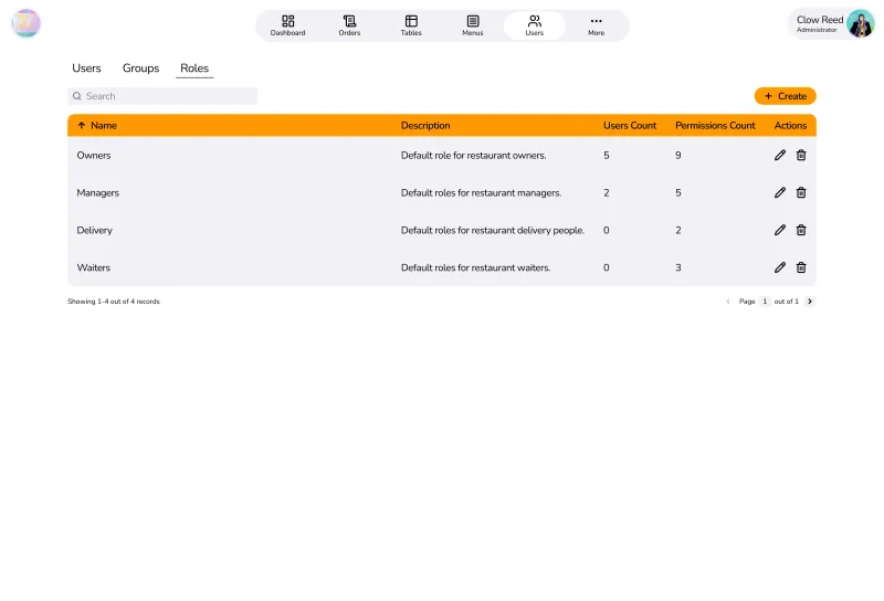
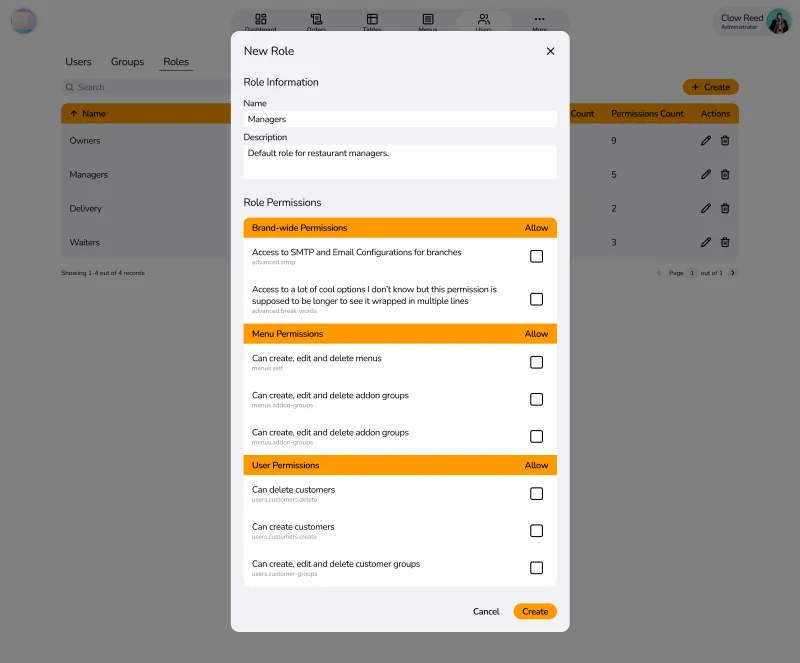
What he prefers is a table of records as that’s the “standard” and easiest to
understand for management apps. I’d appreciate if he could give me actual reasons
that a table of records like a spreadsheet is better, but his comments are:
It’s difficult to learn.
Restaurant managers are stupid with computers.
Restaurant managers don’t have time to learn or train other managers.
I can’t sell another course on how to use the application just to get them to
use it.
Too little whitespace, as managers want huge buttons, not tiny controls and
big charts. They want huge buttons, a flow that can never fail.
Navigation is not needed, even if you use table of records, just have a pop-up
that covers 80% of the screen, with all fields laid out in the pop up, and just
scroll down, change some, click Save, which would be a much easier flow.
Table records are filtered by fields, and have all fields available to look
from the table, instead of having to click a User/Group/Role to know.
Table records can be paginated to not overwhelm the user.
But here’s my reasoning back:
It’s difficult for the first 5 minutes. After that, it’s smooth sailing.
A high-velocity system should have the users be the bottleneck, not the system
being the bottleneck.
If they are stupid with computers, they would not be a restaurant manager
in the first place. EVEN a small mom-and-dad restaurant NEEDS a computer.
There’s a reason there’s a “trial” method with lower pay in those fields.
You don’t have to. If the UI is interactive, when a user clicks a “Role”,
the panes change to reflect that role, and what that role has as permissions,
they understand immediately the relationship between the three panes.
Opposite actually. Managers want as much data as possible that it is quickly
glanceable, not a hand-holding deep-dive into fields to know what is going on.
Whitespace is a UX flaw for these people.
Popups directly kill the context. If you say you want a table to compare
fields, then popups work against that actively. Even a navigation into a page
to edit the fields doesn’t help.
My tree-view is grouped and searchable with a real-time refreshing search
field. It’s actively giving feedback to the manager using the screen.
Groups in a tree-view are collapsible accordions, and so are property
groups in Properties pane. They are collapsed by default, and managers only
expand what is needed for that moment.
Here’s his conclusion:
Your thought process is wrong in the first place. Managers don’t want
a Figma or a Blender-like workspace. They want table records.
Yea. I’m done. I’m open to learning if he has a good reason for it, and so far,
I have not been convinced. All this rethinking just further proved that I’m
the reasonable one here.
He’s an advocate for AIs, so I tried to prompt each free AI I knew to see which
UI style would actually benefit more from a Users Management view.
Gemini: Three-pane is better.
ChatGPT: Three-pane is better, but with the caveats that it has to be made well.
Any delays or lag or silent fail is an architectural fail.
DeepSeek: Three-pane is better. But understands why some people would prefer
the table view.
Claude: Three-pane is better, without questions. Table may work in a restaurant
with 30 staff, but when many branches are involved, it doesn’t work well anymore.
Random Chatbot: Three-pane is better (I mean it was a free model, I don’t expect
it to elaborate).
Afterthoughts
Throughout the last week, I was extremely busy to even cook my own meals, and with
my mother not really fond of home-cooked meals, so we were out eating in restaurants
and establishments quite a lot, such as Yuhua Hot pot, Chang Kang Kung, or Tokyo
Deli. Throughout the meal, I was observing managers and employees, and how they
worked. It seems to confirm a few of my points before hand:
A manager can not focus 100% on his computer, even in a self-serving buffet scene,
he was constantly moving around, getting customers help. So a table layout fails
here.
Most employees and managers are relatively young, and usually very well-versed
in technology itself, so the strawman of a tech-illiterate manager probably doesn’t
exist anymore. A friend of mine working in the restaurant industry also laughed,
because in his entire year of working there, he has never seen a single table-based
layout.
I have observed cashiers and waiters operating on terminals to build our orders
and menu items. And they were never tables. It’s a rather their own
intepretation of the three-pane layout (left was status of the bill, middle was
how they build a menu record, and right was categories of foods and drinks).
A very small restaurant (not even properly qualified as one, just a small family
shop selling their noodles), didn’t even use any machines. They used a small
notebook to mark what item they sold. Are these the type of people that the professor
is trying to cater to, those that would never purchase a system in the first place?
Anyway, my last and final case-closing words would just be, if I’m wrong on this
layout decision, then maybe Apple (all of their apps), Microsoft (Outlook), etc.
are also wrong, and should follow the professor’s footsteps to catch up with
the times.
A Code Review (Updated Feb 2026)
I looked back into the source code of the capstone, at the time of writing this,
February 25, 2026, main branch, in order to check out the progress, as well as
seeing whether there are anything we guessed that might happen.
Here’s a list of “smells” that I found (but I don’t know Tanstack, NestJS or oRPC,
so it might be inaccurate and some may be the best practices):
For example, there are shadow entities everywhere that are called “templates”,
so nothing works if you dont have any templates setup.
BetterAuth forces the backend to use very unconventional workarounds to fit the
use case or requirements, or to imitate another platform (which didn’t use BetterAuth
and just had SQL queries tailored to their specific needs).
All frontend has is placeholder data and non interactive, stuff that are interactive
are very clunky, is not responsive at all (given that the professor talks about
a layman manager on greasy tablets, really great to use layouts that don’t fit
on a tablet).
Backend uses nestjs’s module separation but service code intertwines direct DB
calls, some other services, and throwing business errors in DB transactions.
Uses a big mix of direct db calls vs db views from the ORM, instead of having
a centralized thing that you just grab data from, so there are red lines everywhere
because some types didnt match.
Inconsistent use of table names, weird extensions, plural orsingular, wrong terms
for the domain (such as “teams” for branches, “organizations” for tenants, or “addons”
for modifiers).
Dead code, unused stuff, unused whole directories that were leftovers empty,
just empty files that do nothing.
Ungodly number of chaining calls for methods because they want to support sorting
on multiple columns, building the query right inside a service. My problem here
isn’t that they did it wrong for multi-column sort, but rather, “does the user
need multi-column sort?”. And the answer is usually no.
Specs and tests file that assert 1+1=2.
Most other members have realized the same thing. This is getting really bad. It’s
month 3 of 7, and there is a total number of zero user flows that work from start
to end and can be demonstrated. This may be biased against the frameworks, but I
think this kind of app does not benefit from stuff like oRPC or BetterAuth, as I
assume their use cases are more for general apps that need some level of CRUD and
Authentication, not a full-blown multitenancy platform. oRPC and BetterAuth (which
the leader does not want to remove) might be the biggest problem that if we don’t
root it out, it WILL come back and bite the team later.