Retrospective: Dictionary App
A Series to Look Back: How I re-built a dictionary app meant as exercise for web developers, on native iOS hardware using Objective-C and UIKit, and what I learned from the extra challenge.
retrospective
A Series to Look Back: How we built a B2B platform for F&B industry, with efficiency and usability in mind, and what I was able to collect as new experiences and knowledge points after taking on an unusual role as a Product Designer.
Published on Sep 1, 2026
Updated on Sep 3, 2026
6,172 words • 31 min read
As anyone already knew, at the end of the program for Bachelor’s, there would be a graduation project. FoodBasket is my, or our project. Amidst the AI spamming, with chatbots, simple integrations, we wanted to stand alone as something different, something that aims to solve a problem, other than creating a bunch of softwares that are considered “slop”, such as “studying English with the help of AI”.
I believe that AI is a vital part of knowledge and development for now, as it could help aggregate information to study in one single message, other than having to get through many websites and sources. But I don’t believe that putting AI into everything would make it better, conversely, there have been a lot of criticisms and boycotts for products that “shove” AI unncessarily, as that goes against a lot of ethics and UX goals just to ride on the hype.
For example, here is the list of all 7 projects presented at the Software Engineering committee:
There is a certain bias towards AI from the committee members, since they don’t have most practical experience anyway, but don’t you think it’s a tad bit ridiculous? Guess which project got the lowest score.
We overall got a 90 across the board, which I considered it unfair. Many could say that it was fair that the group should get the same scores for all, but would it be fair to penalize a hard-worker unluckily paired with other lower efficient workers?
Group-based accomplishments:
Usually, I would pay my respects, and give proper credits to all members for all of their contributions, but this project was entirely lopsided that I could only give my highest praise to one member, where as other members would have gotten criticisms. This is the reason why I thought lazily making the team score as each member’s own would be greatly unfair.
draw.io.By these, I think both of us deserve a 100, although I really hate putting myself on a pedestal.
Other members also contributed:
I could see these three getting a 90 for their work. But what I did not like that much was the last person, who should receive at most an 80 only.
I don’t think I was harsh here. But there are more problems that I would go over in the next section.
Timeline Delays:
Scope Creep (or what my online friends joked as featuritis):
Also, stated in this blog post back in January, there were a lot of debates and conflicts on what to choose and go forward with.
| Issue | Root Cause | Impact Level |
|---|---|---|
| oRPC Issues | oRPC was a somewhat new implementation that broke along the way, and could only be resolved upstream by making an issue to the maintainers and requesting a fix. | High |
| BetterAuth limits | BetterAuth was a generic authentication helper library, but it should work well only on generic apps. For an app that required granular permissions and role changes based on context of the POS worker, workarounds for this have to be done constantly. | High |
| No progress on weekdays | Only T.N, G.L, and N.L were available full-time as others had other work. So the Thursday meeting was somewhat useless at times and only served as a playup. | Medium |
| No CI/CD | CI/CD, automated testing and QA, hosting were not available until the last month of the project. As a product designer, I could not test the system until when push comes to shore. | High |
| Terrible System Design | Database and System designs were done from the point of view of normalization and deduplication first, only thinking about how to shape data flows and user flows to fit the designed structure, which constantly got rebuilt. | High |
| Over-reliance on AI | AI again is a great tool, but its capabilities lie with the user. T.N had constantly lamented about the level of slop that he had to fix weekly, just to keep the app running. | High |
| Subpar Communication | Only T.N. and G.L. really commented on the designs to ask questions about edge cases and situations that I had missed. N.L. and V.K. assumed, and D.N. didn’t do anything so no questions there. | Low |
| Ego | D.N. had a rather large ego and a terrible listener. He seemed to tune out any other arguments that didn’t match his method, and always seemed to feel hurt when challenged. | Low |
This might have just been bias from such a nightmarish stack, but I just no longer felt any hope or any visions of me possibly integrating oRPC or BetterAuth in the future.
A compiled list of all debates throughout the project, you could skip down to the following section if it would be too long.
| Split | Unified | |
|---|---|---|
| Backers | Me, Prof | DN, NL |
| Details | One application for POS workers, one application for platform administrators, and one application for users, separated but under the same branding. | One application for everything, but separated by paths and routing. |
| Reasoning | Split stack, best optimized for the use cases, allow parallel development. Easier to deploy natively. | Simpler and easier to work with. |
Result: Unified.
| Tables | Master-Detail | |
|---|---|---|
| Backers | DN, Prof | Me, TN, GL |
| Details | Use tables with big rows, and edit/delete buttons for all entities management, from menus, items to modifiers. | Anchored master list on the left, with the middle pane changing based on context, with the right pane being the method to change data and properties. |
| Reasoning | Easy to use, easy to implement right. | Fast to use, but difficult to implement right. Sacrifices a low floor for a medium floor and a high ceiling. |
Result: Tables at first, then pivoted to Master-Detail by month 2.
| Categories in Items | Categories in Menus | |
|---|---|---|
| Backers | DN | Me, TN |
| Details | Items have predefined categories in items-edit page. Adding it to a menu automatically adds the category. | Items are isolated. Menus have categories as groups, and items reside in those groups freely. |
| Reasoning | Easy to categorize and analyze later, which category did best. | “Not everything needs to be analyzed”, and categories as grouping in menus felt natural to anyone who had used a menu before. This also allowed drag-n-drop builders to be usable. |
Result: Categories in Items at first, but due to the efficiency being so terrible that it was pivoted to Categories in Menus the next week.
| An Item has Modifiers | An Item has Modifier Groups | |
|---|---|---|
| Backers | DN, NL | Me |
| Details | An item has many modifiers. Each modifier belongs to a group. When displayed, the modifiers are grouped back into their group. | An item has many modifier groups. A modifier group has many modifiers. |
| Reasoning | The item can add or remove modifiers selectively for customization. | Easier to query, faster to structure and could also remove selectively at item-level but sacrifice adding. |
Result: An Item has Modifiers at first, but due to it being too complicated and odd that others didn’t understand, pivoted to An Item has Modifier Groups.
| A Modifer is an Entity | A Modifier is a Record | |
|---|---|---|
| Backers | DN, NL | Me |
| Details | A modifier can be, “0%” for example. And many groups can refer to this “0%” such as Salty, Spicy, or Sweetness. | A modifier is a mere tag that belongs to a group. Duplication between groups is expected. |
| Reasoning | De-duplication and efficiency. | Easier to reason about, and transfer that knowledge through UIs. |
Result: A Modifier is an Entity at first, but again, due to it being too complicated that others didn’t fully understand, pivoted to A Modifier is a Record.
This debate, when looking back, it was wrong for both sides. The thing that dictated it should be requirements and user flows, then UI, then database.
| Database dictates UI | UI dictates Database | |
|---|---|---|
| Backers | DN, Prof | Me |
| Details | The database must be designed first, then the UI must follow the outlines by the database. | The UI must be designed first, then the database must follow the outlines by the UI. |
| Reasoning | A UI can have anything. A database must be optimized. | A UI is the gateway for the user. The database can be anything to fit the correct case. |
Result: Database dictates UI at first, but throughout the project, it started to become UI dictates Database unknowingly.
| SSE/REST | Short Polling | |
|---|---|---|
| Backers | Me | NL |
| Details | Use SSE for all pub/sub-related systems and notifications. Use REST for updates. | Use short polling and REST. |
| Reasoning | WS may be too difficult to keep for a capstone. SSE and REST serve as a great middleground. | Easier to implement and fix. |
Result: Short Polling.
| Templates / Coupons / Campaigns | Campaigns | |
|---|---|---|
| Backers | Me | DN |
| Details | Templates dictate the “What” to send. Coupons dictate the “When” the campaigns apply. Campaigns are the engine that tie templates and coupons together. | Campaigns contain coupons and templates, coupons have enumerated types and campaigns send templates as email to customers. |
| Reasoning | Provides a way to allow automated order coupons at the restaurant level, but keep printing and marketing to the marketing department and out of scope. | Includes printing and everything needed to make a campaign easy. |
Result: Undecided, marked as out of scope by me at Month 5/6 and closed all PRs related.
Debates aside, I will now move on to discuss what decisions I have gone through to build the following high-fidelity UIs that get implemented by the team’s engineers.
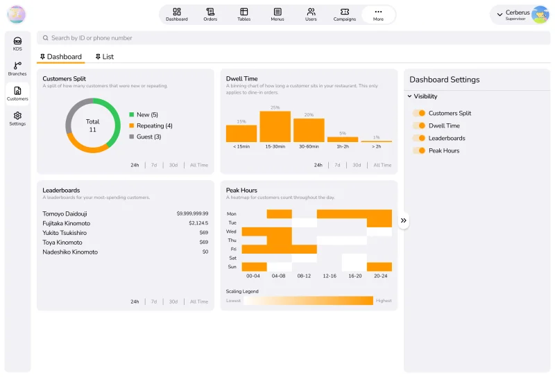
The project as a whole, meant to serve the idea that in F&B managements, entities are very closely related to each other, usually including or referencing each other no fewer than dozens of times, and not isolated entities to be managed. I envisioned a native-app system that allows managers and workers to see an entity and its relationships, and immediately see that same relationship from the other entity’s view, making up the feeling that everything is an interconnective web that feels smooth to move around.
When you usually start doing certain things at university for your Computer Science courses, I’m sure you have heard your professors talk about ease of use, and ease of adoptability, or some standard layouts to make it easy to onboard. My supervising professor was the exact same.
But is that the correct way to do this?
Unlike an app or a website on a user’s phone, where you only have mere seconds to capture their interest before they leave (also called Bounce Rate). For a business app, that would not be the case as the managers and the employees would be expected to learn the system. And sometimes, people forget that these types of people, either expectedly or unexpectedly, WANT their system to be complicated IF it could make their job more efficient. That’s what I bet on, such as all jobs having a trial phase for their newcomers.
I wanted to design a system that would be extremely fast under a high-level user, but still approachable by someone who just started. The design also went with certain ideas such as Progressive Disclosure, and expected Mental Models to help guide the newcomers around the system without having to add obnoxiously intrusive interactive guides that end up irritating veteran users.
For this reason, I didn’t go full on dashboard and panels, but separated them into layouts (also more commonly knowned as Master-Detail) with panes. People may think that it’s a novel layout not everyone does, but it’s more likely that you just never noticed it. Apple apps, Gmail, Outlook, Power BI, etc. all employ variations of the layout, if you noticed.
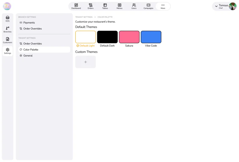
Funnily enough, I mentioned a lot that this was non-negotiable, and must not be cheaped out as it was comparatively easy to implement when compared to other features.
D.N did not understand that this was not just a simple CSS change, but vital to any B2B platforms. A tenant renting from us, should be able to customize their restaurant chains to match their brand identity. That gives us a selling point over centralized discovery systems like DoorDash or Grab, but also gives the tenants a good feeling of seeing something that felt like it was theirs.
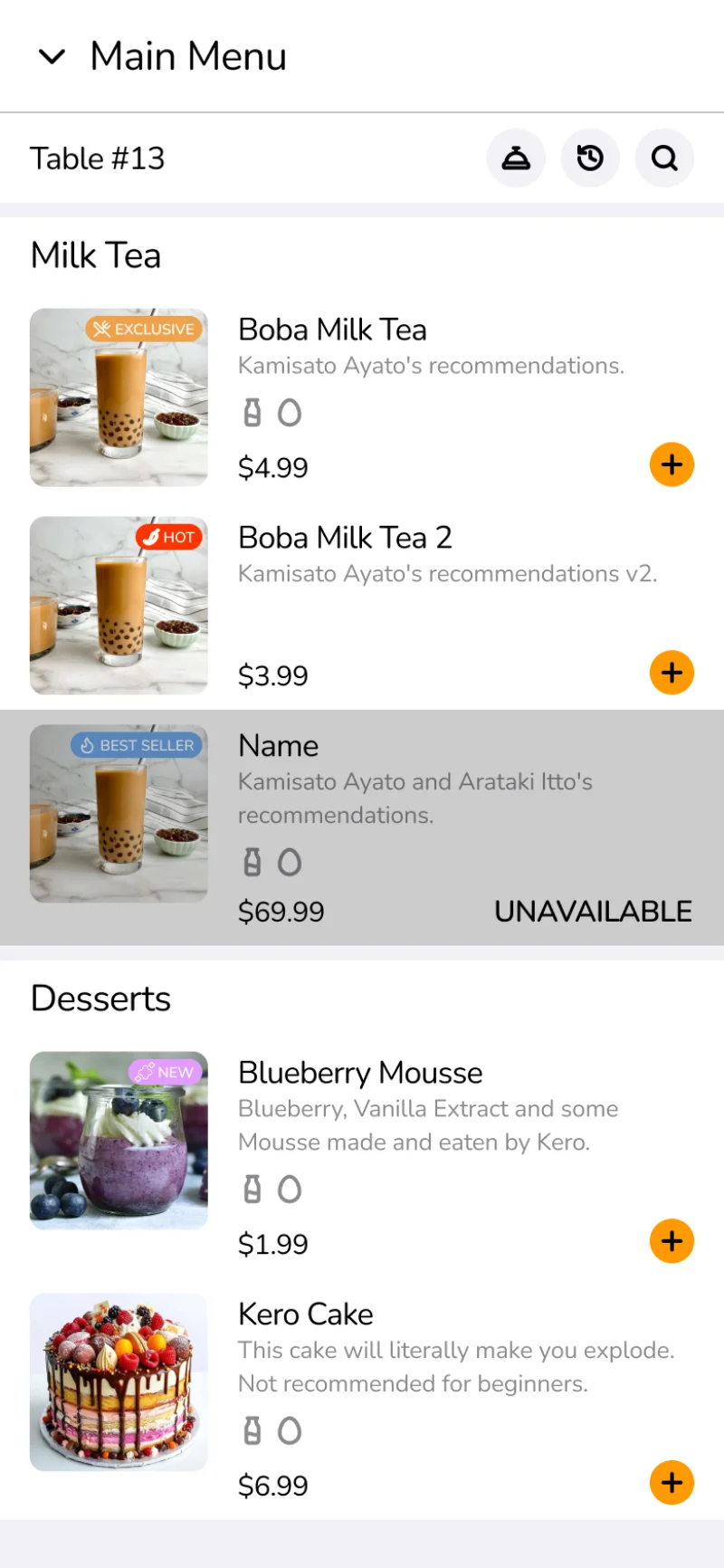
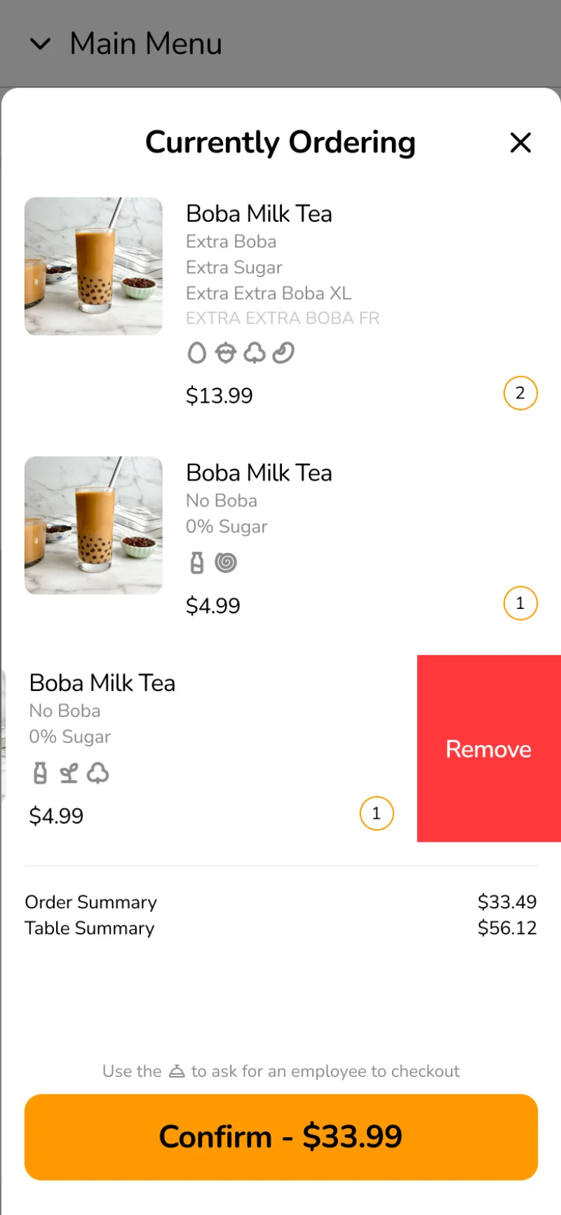
As you can see in the two screenshots above of the conceptual UI. I went with a very mobile-native approach, such as swipe to delete, with sheets, popups and layers on the Z axis just like any mobile native application.
A few things I thought was funny, since this is a “dine-in” system, I got a few comments from the committee, that once you heard, you could tell they were not acting in good faith, or they did not have enough knowledge to ask questions, but still thought they did which resulted in a lower-than-expected final grade:
I might have been harsh, and they might not have been serious in questioning but only as some questions to see how we thought. But the others were not comfortable with me rebutting the questions, so we didn’t.
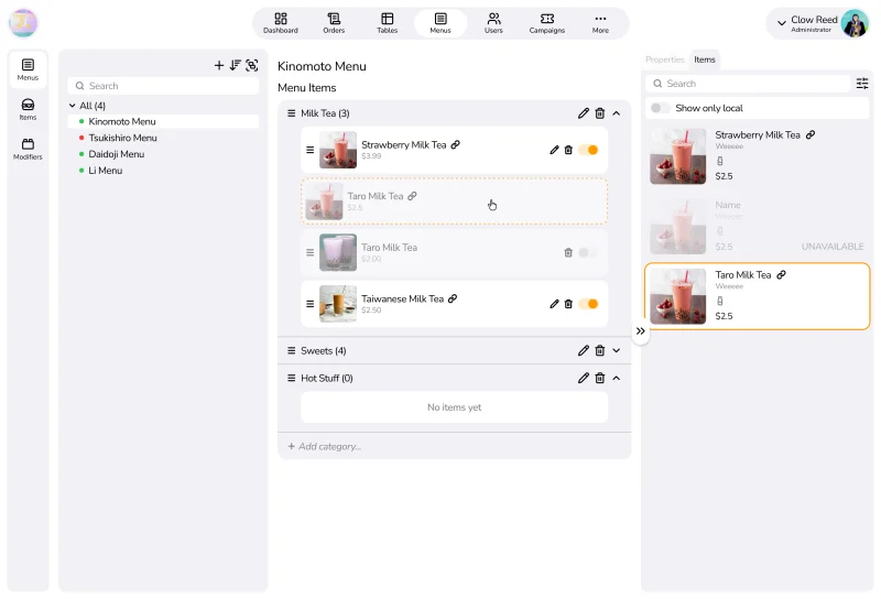
I believe that GloriaFood did this part extremely well, that a menu building process is not a management process, but a creative process. Similar to a musician on a score, items and structures change extremely frequently, and that’s why I wanted to provide a canvas for managers to build menus on without friction from saving and clicking edits back and forth.
Menus also still adhered to our slogan, “Centralized Discovery, Broad-phase Controls, but Granular Customizations”. Each item added to a menu could be selectively enabled or disabled, or had its price overwritten for that specific menu.
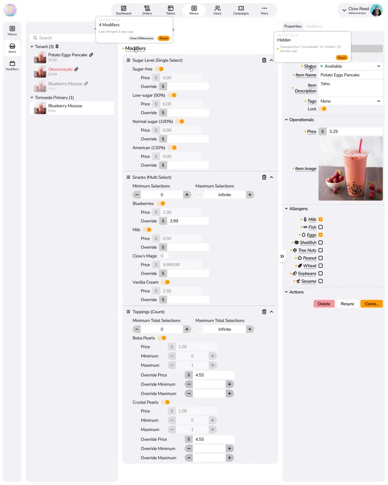
Among the Details and the Properties pane, you could see labels that are normally displayed, but there are also labels that have a dashed underline, printed in italics and sometimes have an orange dot next to it. This is the markings for our (or my) best design decision so far, the Master-Local Architecture.
Before, D.N. and N.L. made a system that each item must have a “template” created
at the “template” team (very weird wording for “tenant-level”, as that’s the workaround
for BetterAuth). Each branch must “shadow clone” it (empty record but has a ref
field) before using it in a menu for a branch. If a branch does not override a
property, it would be NULL and automatically retrieved from the ref. Certain
problems arise immediately: What happens if a ref was deleted? What happens to all
the clones? They said they have fixed this with deep cloning (I still don’t know
at this point what deep-cloning means for them)
After a while, it somehow got to that my design was followed instead of theirs, and T.N. made a huge refactor of over 10k+ lines changed pull requests over multiple weeks. Which is now:
After, I made a system that each item has a scope it belongs to. An item that belongs to the tenant as a whole is a master record, and an item that was cloned from a master record is a local record. An item that was created for a branch scope is also called a local record, just without a ‘reference’ back.
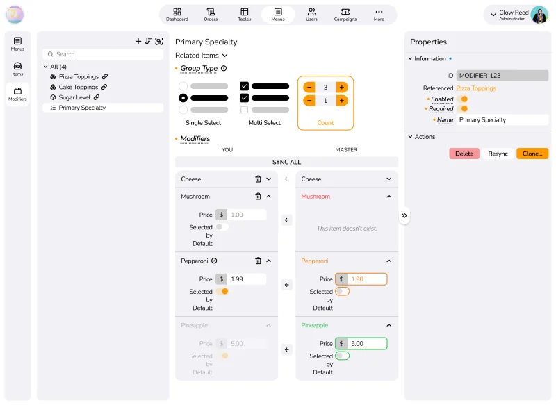
Onto here, we can see what happens when a diff view was enabled to compare a local modifier group to its referenced master record. Changes, removals and additions are color-coded differently, and there is a way to accept one change in isolation, without having to accept other changes.
This replaced D.N.’s original idea that when there was any change, a popup would appear on the branch-scoped manager’s screen, asking for an accept or a reject for every single change. You can probably already imagine how badly this would scale without me having to spell it out.
This part, however, is something I had a lot of issues with. There were certain things that were not as simple as professors and others think they were. The method I went with was not optimized by any means, but it was the best I could come up with, which showed I had a lot more to learn.
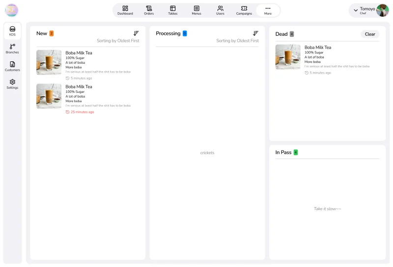
I went with a Trello-like, Jira-like approach for this section, where dishes are cards that you swipe to the right column, step by step to simulate the cooking process (New to Processing, then to either Dead or In Pass). There are more states to the dish entry, but I reckon that a kitchen should only care about these four, so I omitted the rest from this specific screen.
One thing I did not really like about this design is that, each dish, if ordered 4 copies of one dish, would create 4 cards. This was requested by me, to also cover the edge case that a family ordered 6 for example, but wanted to cancel 2 only, a bundled card would not be able to. I had ideas, such as separated at backend-level, but when at frontend-level it must be combined in some ways, such as hashing an item and its notes, etc. but ended up not implementing these fix ideas.
Now here are the usual bad-faith-looking questions from the professors:
One of the most different features we have implemented.
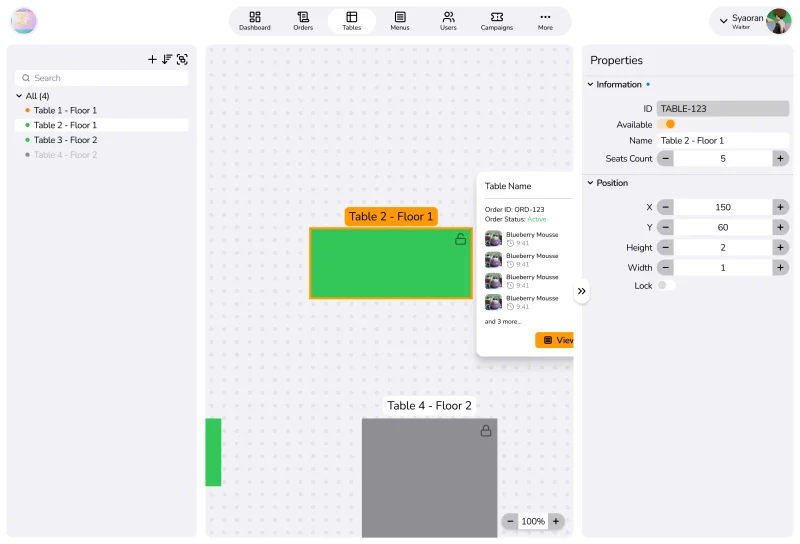
Usually if you have seen on POS tablets, tables are usually just square blocks at very rigid locations, that employees would have to remember what and where to tap. We took this further, based on TastyIgniter, that a free-form tables map, where it could be drawn and moved around by managers. But when it comes to the waiters, they could see at a glance using color-coding which table is open, which is unavailable and which is serving. By tapping the table, the view is centered onto that table, showing the current order and a view into its entries, while also allowing taps to move seamlessly to the management of that order, still keeping up the idea of an interconnective application.
Before, we just used concrete roles provided by BetterAuth, but I suggested that we should take after TastyIgniter for this one also, and provided a way to customize roles and its permissions. It wasn’t as powerful as I wanted it to be, but we got it to somewhere good enough.
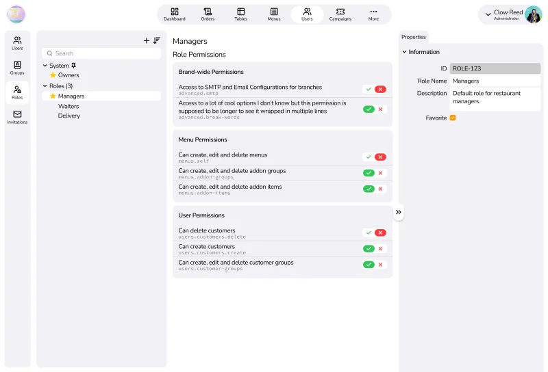
A user can have many roles, with one role as the “main” one (just semantic, no logical meanings). A role can have many permissions. Permissions are calculated using unions (although I would have preferred them to be intersections), such as were role A not grant permission A, but role B did, the person with both roles would be able to do A. I would have wanted the opposite, that one No would cancel out millions of Yes. I thought it would provide a much safer way (better safe than sorry) for large chains managing many employees at the same time, so that it requires some level of concentration to not make a mistake for granting permissions.
A platform like this should at least have ways to monetize, such as GloriaFood selling additional features as addons to the tenants. We should think of the same things, whether we end up implementing them or not, as that show product ownership and future thinking, rather than just doing something for no reason.
D.N. and N.L. did not understand this, as they only considered this a project to get the degree. They also objected to any monetization ideas, and seemed to use the excuse that it was hosted on a $5 credited Railway server as a reason to not scale. But that’s the point, we have to plan for it to scale, or its forceful scaling would burst the bubble.
D.N. on the other hand was someone who believed that every service should be free. He did not want to pay for VPS hosting, domains, branding, etc. Even when the final reports and catalogues should be submitted, he didn’t want to choose any high-quality Caucher papers, but settled for Ford papers, almost diminishing 6 months of work by being petty. Luckily, the committee did not need to take hard copies, so printing was for naught, but if they did, we missed out entirely on a chance to stunt their questioning by simply paying a little bit more.
Saying it out loud might make you sigh, but when you calculate everything, from hosting, domains to printing everything, across 6 months and split between 6 members, each member only would have to pay an equivalence of 10 large milk tea cups ONE TIME (not even each month).
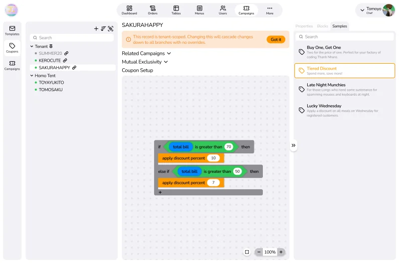
A scraped feature. Coupons seem very simple on first look, but when you analyze them just for a second, you start to see why a lot of platforms choose to restrict coupons a lot (such as Shopee only allowing you to create coupons that discount over a total price, and nothing more). D.N. did not understand this, and only started writing coupons as having only Buy One Get One, Discount Percent and Discount Fixed.
Certain questions would instantly stump that system, and any requests from tenants for other types of coupons would start to crack that system instantly:
These are nowhere near far-fetched situations, yet the system already couldn’t handle it. This is why as a service provider for business, we would have to be able to cover any cases that a business needs, and if we couldn’t, we must have a system that is capable of extending there easily. This is what made me come to the idea that a drag-and-drop Scratch-like rule-building interface, while using AST under the hood would be the way to do it, as any new requests could be added as a block.
Due to the lack of talent (only T.N. would be able to implement this, realistically), and lack of time on fully analyzing every case, we agreed to drop this feature.
There were a lot of road bumps, slopes and hills along the way, but like the feeling of finishing an exam, whether you did well or not, you felt much more comfortable and easier.
I was not happy with a lot of decisions made, but a lot of my decisions stayed, which contributed to me as a decent designer, and that TN was able to pull all the big guns to make something that should be boasted about in later interviews. If we stayed with tables, TN might have never discovered he could build such systems, that product companies like Canvas would headhunt for. I might not be able to go far in the field, but by pushing myself to the limits, I also pushed TN past his limits, and that might be his ticket to climb much further than I ever may.
Kinomoto Sakura
A Series to Look Back: How I re-built a dictionary app meant as exercise for web developers, on native iOS hardware using Objective-C and UIKit, and what I learned from the extra challenge.
A Series to Look Back: Developing a system for examination registrations, following the full-flow from requirements to implementation based in Enterprise Software Processes
A Series to Look Back: A misunderstanding between university professors and software specifications as I try my best to justify my direction.